
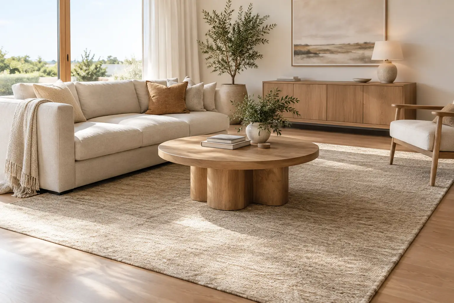
A neutral rug can be the quietest element in a room and still do the most work. It softens timber or tile, gathers furniture into a clear arrangement and gives a space somewhere to settle visually. The key to how to style neutral rugs is not treating neutral as a non-choice. It is a palette of subtle decisions around undertone, texture, scale and contrast.
A rug in ivory, oat, sand, taupe or muted charcoal can make a room feel composed without making it feel flat. But when its size is too small, its undertone clashes with the floor, or every surface carries the same visual weight, that restrained effect can become indistinct. Start with the role the rug needs to play, then build the room around it.
Begin with proportion, not colour
Before considering cushions, throws or artwork, establish the rug’s footprint. A neutral rug often has less contrast than a patterned or dark design, so its scale matters even more. A generously sized rug creates an architectural base beneath the furniture. A small one can leave the room looking fragmented, regardless of how considered the colours are.
In a living room, aim to place at least the front legs of the sofa and occasional chairs on the rug. This gives the seating area a shared boundary and makes a room feel more generous. Where space allows, placing all furniture legs on the rug creates an especially grounded arrangement. As a guide, leave around 20 to 40 cm of visible flooring between the rug and walls, rather than pushing it hard against the perimeter.
For many Australian living rooms, a 200 x 300 cm rug works as a starting point for a compact sofa setting, while 250 x 350 cm or larger may suit a broader open-plan area. Measure the furniture layout first, including side tables. The rug should support the whole composition, not merely sit beneath the coffee table.
In a dining space, allow at least 60 cm beyond the table on every side so chairs remain on the rug when pulled back. Bedrooms benefit from a rug extending approximately 45 to 60 cm beyond both sides and the foot of the bed. These allowances are not rigid rules, but they protect the visual calm a neutral palette is meant to create.
Choose a neutral that relates to the room
Neutral does not mean one colour. A warm ivory can feel creamy beside honey-toned oak, while a cool grey-beige may appear slightly blue against terracotta tiles or warm white walls. The most successful choice usually relates to the fixed elements already in the home: flooring, benchtops, paint, curtains and larger upholstered pieces.
Look at undertones rather than colour names. Sand, biscuit, clay and warm taupe usually sit comfortably with oak, walnut, travertine, aged brass and warm-white paint. Stone, mushroom and muted charcoal can bring definition to rooms with cooler greys, polished concrete, black detailing or pale ash timber. If your home contains both warm and cool finishes, a mid-tone taupe or softly flecked design can bridge the two.
Natural light changes this decision. A coastal room with strong afternoon sun may make cream appear brighter and more yellow than expected. In a south-facing apartment or a shaded character home, a pale rug can lift the room, but it may need richer timber, chocolate brown or charcoal accents to avoid feeling washed out. View samples or imagery in the light your room receives most often, not only in the brightest part of the day.
How to style neutral rugs with tonal layers
The easiest way to create depth is to work within a narrow tonal range while varying materiality. If your rug is oat or ivory, pair it with linen in flax, upholstery in warm beige, timber with visible grain and ceramics in chalk, clay or soft brown. The room will feel connected because the colours share a temperature, yet each surface catches light differently.
Avoid matching every piece too closely. A beige sofa on a beige rug can be calm, but it needs distinction through texture, shape or a shift in depth. Consider a low, textural rug beneath a bouclé or linen sofa, then introduce a timber coffee table or darkened metal lamp to give the arrangement a little definition. Broad, quiet curves in an armchair or table can also soften the repeated straight lines of a sofa and rug.
A restrained palette does not require a colourless room. One deeper note can bring a neutral scheme into focus. Muted olive, rust, ink, tobacco, forest green or dusty blue work well when repeated sparingly through a cushion, artwork, vase or occasional chair. Think of colour as punctuation rather than the main sentence.
Use contrast in at least one direction
When a room relies on neutrals, create contrast through one or two deliberate elements. This might be tonal contrast - a pale rug under a mid-brown sofa - or textural contrast, such as a sculptural wool surface against sleek leather and stone. Shape can do the same work: a rug with a subtle border, grid, fold or abstract movement adds presence without introducing loud pattern.
If the sofa, walls and rug are all pale, bring in visual weight through a darker timber table, black-framed artwork or an earthy ceramic. Conversely, a deep charcoal sofa may feel less heavy when grounded by an ivory or sand rug with a gentle tonal design. The goal is balance, not a dramatic before-and-after effect.
Let texture carry the room
Neutral rugs are especially useful where hard finishes dominate. Tile, polished concrete, floorboards and glass can all look crisp, but they benefit from a softer layer underfoot. Texture gives a restrained room its sense of welcome.
Consider the existing mix of surfaces before choosing the rug. In a home with smooth cabinetry, stone benchtops and leather seating, a rug with visible pile variation, a subtle linear weave or tactile surface can introduce relief. In a more layered room with linen curtains, woven baskets and heavily grained timber, a flatter rug with soft geometry may provide a calmer counterpoint.
There is a practical side to this as well. Highly textured surfaces can create a stronger visual presence and may show the direction of the pile more readily. A lower-profile, tonal rug can be easier to integrate in busy circulation areas. Neither is inherently better. It depends on whether the room needs softness, definition or a little visual restraint.
Define zones in open-plan homes
In open-plan living, a neutral rug can clarify how each area is used without interrupting the flow of the room. Place one beneath the lounge setting to create a clear conversation zone, even when it sits close to a dining area or kitchen island. The rug should be large enough to contain the furniture you want people to read as one group.
You can use different neutral rugs across adjoining zones, but give them a common language. They may share warm undertones, a similar level of contrast or related materials, while differing in scale or pattern. For example, a broad ivory rug with soft movement can ground the living room, while a smaller taupe runner gives the entry a sense of connection without looking identical.
Avoid placing rugs so close together that they appear accidental. Leave a purposeful stretch of flooring between zones, particularly on timber boards or large-format tiles. That visible floor acts as a pause, allowing each rug to define rather than compete.
Build around the rug without over-styling
Once the rug is in place, keep the styling edited. A coffee table needs enough negative space around it to show the rug’s surface, while a few well-chosen objects can echo its tones: a stone vessel, a stack of books, a timber tray or a softly coloured glass piece. If the rug has sculptural patterning, simpler accessories usually let it read clearly.
Curtains are a useful connector in neutral rooms. They do not need to match the rug, but they should share its warmth or coolness. Oat curtains with an ivory rug create softness in a bright room; mushroom or taupe curtains add depth where walls and flooring are very pale. Keep artwork slightly more contrast-rich than the walls so the room retains a focal point above the furniture line.
In family homes, it is also worth leaving room for everyday ease. A neutral scheme need not be precious. Choose a scale that accommodates feet, toys, a side table or a dog bed without making the seating area feel crowded. Rotate movable pieces occasionally if traffic consistently falls in one place, and follow the care guidance provided for the specific rug material and construction.
Let the room feel lived in
The most convincing neutral interiors are not built from one shade repeated perfectly. They are composed from related tones, varied textures and furniture arranged with enough space to function well. A rug provides the base, but the room gains character from the timber that has deepened over time, the chair with a softer curve, the art you have kept, and the objects used every day.
When choosing a neutral rug, trust the option that gives your furniture a clearer place to belong. If it makes the room feel quieter, warmer and more settled without asking everything else to match, it is likely the right foundation to live with for years to come.