
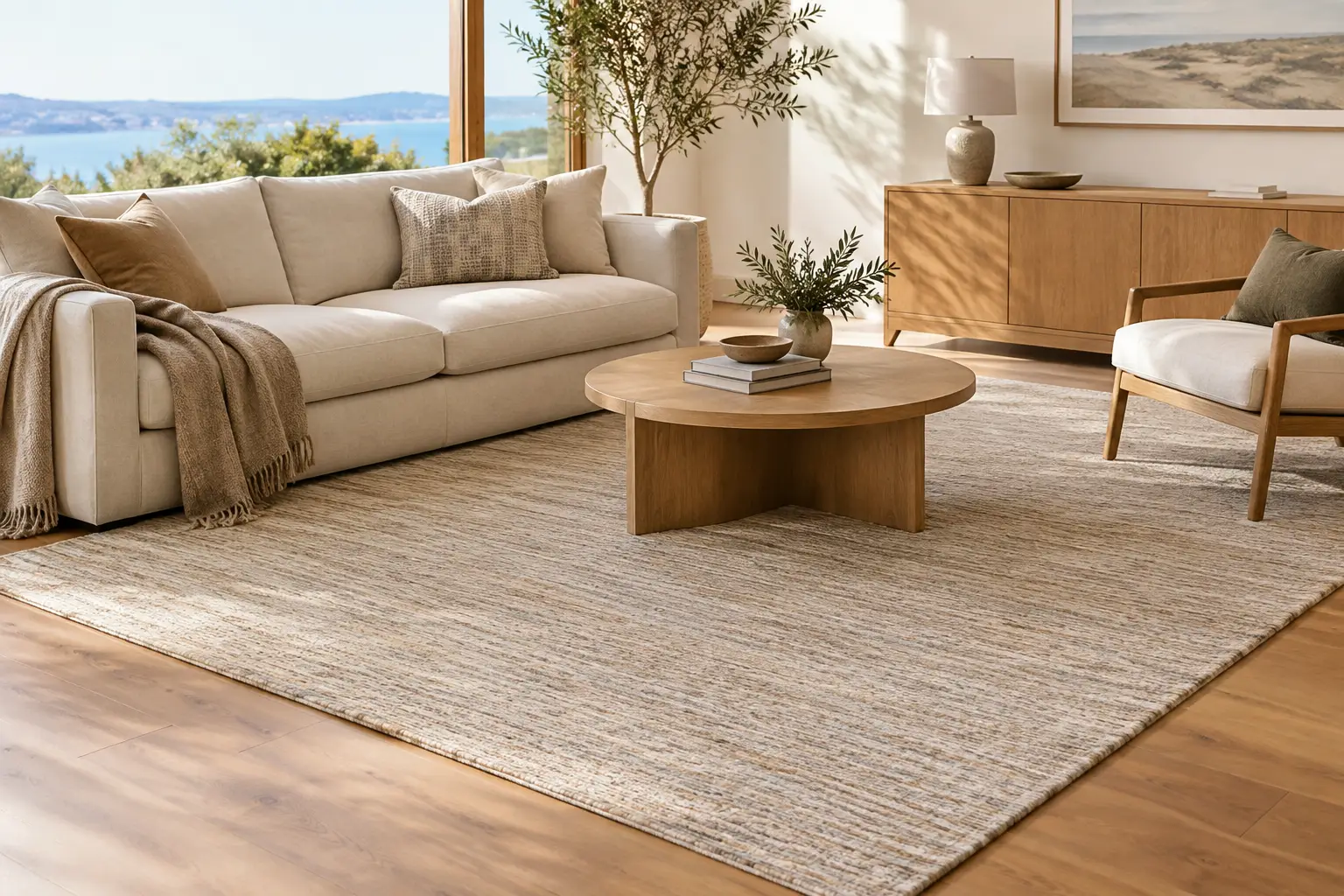
A rug that looked softly beige on a screen can read cool, pink or almost grey once afternoon sun reaches the living room. That is why choosing Australian rug colours is less about finding a universally flattering shade and more about reading the particular conditions of your home: its light, flooring, furniture and daily rhythm.
For many Australian interiors, the most enduring starting point is a restrained warm-neutral palette. Ivory, oat, sand, taupe, stone, clay and softened brown bring visual warmth without competing with the architecture or the objects already in a room. Used with care, they create the composed, liveable feeling that makes a room easier to settle into.
Australian rug colours begin with the room’s light
Australia’s light is often clear and high contrast, particularly in rooms with broad windows, pale walls and hard flooring. A colour that feels balanced in a softly lit showroom image may appear markedly different in a north-facing family room or a coastal apartment flooded with reflected light.
North-facing rooms generally receive the strongest, warmest daylight. Here, pale ivory and sand rugs can feel open and airy, but very light tones may lose definition against cream walls, pale oak floors and off-white upholstery. A rug with a subtle border, tonal movement or a gentle shift towards oat or taupe adds enough visual weight to hold the seating area together.
South-facing rooms tend to receive cooler, softer light. Warm beige, clay, mushroom and muted brown are useful counterweights, especially alongside grey tiles or concrete-look floors. The goal is not to make the room yellow. It is simply to introduce warmth that stops the space from feeling flat or overly crisp.
Urban apartments can have a different challenge: limited direct light, often paired with darker joinery or neighbouring buildings. In these rooms, a mid-tone stone or taupe rug may be more grounding than a deep charcoal, which can make a compact lounge feel visually smaller. Conversely, a bright coastal room with white walls and timber can carry a muted charcoal or tobacco-brown note well, provided it is echoed elsewhere in the room.
Before deciding, place fabric samples, paint swatches or even a folded throw where the rug will sit. Look at them in morning light, late afternoon and with lamps on at night. Colour is relational. It changes according to what surrounds it.
Start with undertones, not colour names
‘Beige’ is not one colour. Neither is grey, cream or brown. What matters most is the undertone beneath the main shade: yellow, pink, red, green or grey. A rug can be called taupe yet feel wrong beside your sofa if its underlying colour pulls in a different direction.
A practical way to assess undertones is to compare the rug colour with the largest fixed surfaces in the room. These are usually the floor, walls, sofa and curtains. Timber floors may lean honey, red, blonde or smoked brown. Stone-look tiles can read warm putty, blue-grey or charcoal. Even white paint can have a warm cream base or a cooler grey cast.
If your home has warm oak flooring, linen upholstery and creamy walls, look towards oat, sand, mushroom, clay and warm stone. These colours continue the warmth while providing a distinct layer underfoot. A rug that is too cool-grey can appear disconnected, as though it belongs to a different scheme.
For cooler grey flooring or concrete finishes, do not assume a grey rug is the only answer. A muted taupe, brown-grey or clay-based neutral often makes the room feel more balanced. Repeating the floor colour too exactly can remove the sense of depth a rug is meant to bring.
Warm neutrals give a room structure without noise
The strongest rug colours are often quiet ones. A warm-neutral rug can soften tiled or timber floors, reduce the visual busyness of open-plan spaces and bring different furniture pieces into a single composition. Its value is not that it disappears. It is that it holds the room without demanding attention.
Ivory and oat for softness
Ivory and oat work especially well in rooms with a lot of natural timber, curved upholstery, linen curtains or pale walls. They add softness and reflect light gently, making them a considered choice for smaller lounges and bedrooms.
There is a trade-off. Very pale rugs show contrast more readily, whether that is a dark crumb, muddy shoe mark or the general evidence of everyday life. A tonal texture, subtle fleck or low-contrast pattern can be a more forgiving option than a single, uninterrupted pale field. It retains the lightness while bringing a little more everyday ease.
Sand, taupe and stone for flexibility
Sand, taupe and stone sit comfortably between light and dark. They are particularly useful if you expect your furnishings to evolve, because they work with cream upholstery, brown leather, muted greens, charcoal accents and most timber tones.
These mid-neutrals are also well suited to open-plan homes. A 2 m x 3 m or 2.4 m x 3.4 m rug in a settled taupe can define the lounge zone without creating a sharp visual break from the dining or kitchen area. It gives the furniture a grounded centre while allowing the room to remain open.
Clay and brown for depth
Clay, cocoa, tobacco and softened brown bring depth to rooms that feel too pale or carefully matched. They suit renovated character homes with warm floorboards, contemporary spaces with travertine-like finishes, and homes where black metal details need softening.
Brown is not necessarily heavy. In a rug with broad, quiet curves or textural variation, it can read as warm and sculptural rather than formal. The key is proportion. A deeper rug colour generally benefits from some visual breathing room around it: lighter walls, a pale sofa, or a floor that creates gentle contrast.
Use contrast to anchor furniture
A rug should have enough contrast with the floor to clarify its role. If the colour is almost identical to the flooring, the rug may look undersized or lost, even when the dimensions are right. If the contrast is too strong, it can divide a room into blocks and make the arrangement feel less relaxed.
Aim for a visible but softened distinction. On pale timber, a stone, taupe or clay rug often has more presence than ivory. On dark floorboards, an oat or sand rug can lift the room while keeping the seating area grounded. With patterned tiles, quieter rug colours are usually more successful, allowing texture and materiality to do the work rather than adding another competing element.
Placement matters as much as colour. In a living room, having at least the front legs of the sofa and occasional chairs on the rug gives the colour a clear architectural purpose. A small rug floating between furniture can make even a well-chosen shade feel incidental.
When to choose charcoal or grey
Muted charcoal can bring calm definition to a room with pale floors, light upholstery and generous daylight. It is useful when a space needs visual weight, particularly in a large living area where lighter elements risk drifting apart. Choose charcoal with warm brown, taupe or softened black undertones rather than a blue-black shade if the rest of the interior is warm-neutral.
Grey works best when it relates directly to another finish in the room, such as concrete, veined stone or brushed metal. In homes built around oak, cream and terracotta, a cool grey rug can interrupt the palette. A greige, mushroom or charcoal-brown alternative will often feel more resolved.
This does not mean every room needs warm tones. A cooler palette can be composed and inviting when it is intentional. It simply needs repetition: grey-blue artwork, graphite joinery or steel details can give a cool-toned rug a reason to be there.
Let texture carry some of the colour
Flat colour is not the only way a rug registers in a room. Texture catches light differently across the day, adding depth even within a narrow tonal range. A surface with a raised line, low-contrast grid, subtle fold or abstract movement can make a sand or stone rug feel layered rather than plain.
This is especially valuable in homes with restrained palettes. If the walls, sofa and curtains are all tonal, texture creates distinction without introducing a new colour family. It also helps a rug remain interesting from across the room and satisfying up close.
For a bedroom, this quietness can be particularly effective. A warm ivory or oat rug extending beyond both sides and the foot of the bed softens the first step of the day while giving the bed a stronger sense of proportion. In a dining area, a more grounded mid-tone is often easier to visually maintain, especially beneath timber chairs and a table that sees regular use.
Build a palette that can change with you
The most useful Australian rug colours leave room for change. Cushions, art, ceramics and throws can shift with seasons or taste; the rug is usually intended to stay. A grounded neutral gives you flexibility to bring in olive, rust, ink, dusty blue or deeper brown later without needing to rework the entire room.
Rather than matching every item exactly, repeat one or two undertones across the space. A clay note in the rug might be picked up in a ceramic vessel and a timber dining chair. A charcoal line in the rug can relate to a lamp base or framed artwork. These small connections make a room feel considered without becoming overly coordinated.
When choosing between two shades, favour the one that supports the home you already have, not only the image you have saved. The right rug colour will give your furniture clearer proportion, soften the hard finishes and make the room feel more settled in the ordinary moments of daily life.