
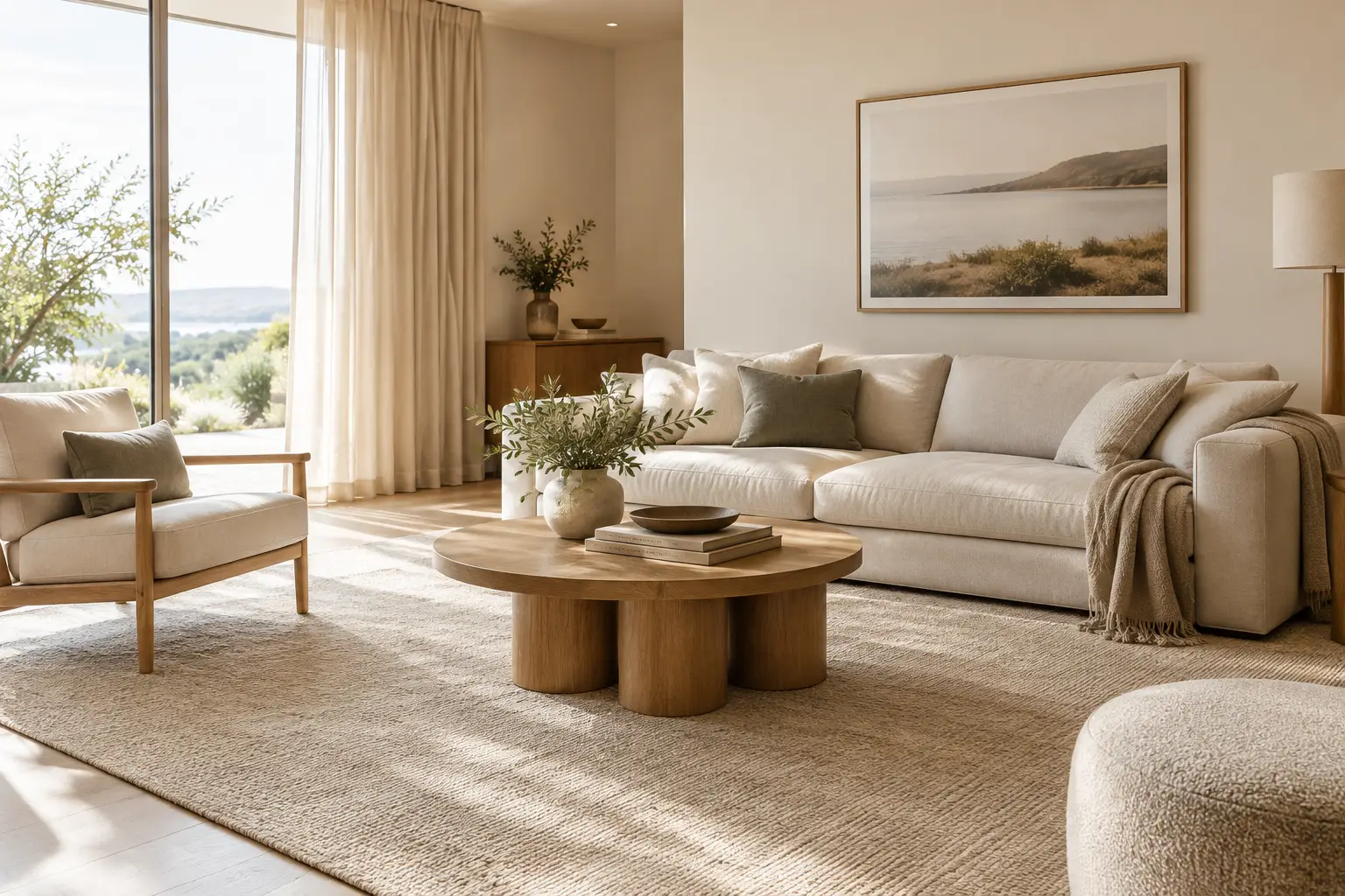
A room can have cream walls, oak floors and linen cushions yet still feel slightly unresolved. Usually, the missing element is not another decorative object. It is a stronger sense of relationship between colour, texture, scale and the way the room is used. Warm neutral interiors work when these quieter decisions are composed as a whole - creating calm without becoming flat, and character without relying on visual noise.
The appeal is easy to understand. Warm neutrals suit the clear light of many Australian homes, soften tiled and timber floors, and sit comfortably beside indoor-outdoor living. More importantly, they leave room for a home to change. A considered foundation of ivory, oat, sand, taupe, clay and brown can accommodate a new artwork, a darker timber table or a well-loved armchair without requiring the entire room to be reworked.
What makes warm neutral interiors feel considered?
Warm neutral does not simply mean beige. It describes colours with an undertone that reads as sun-warmed rather than icy: a creamy white rather than blue-white, a mushroom taupe rather than cool grey, or a brown with traces of clay or caramel. The palette can be light or deep, but it should feel connected.
The most liveable rooms usually rely on tonal variation rather than sharp contrast. Think of a pale wall, a slightly deeper sofa, timber furniture and a rug that holds both colours together. Each surface has enough distinction to be legible, yet nothing appears isolated. This approach gives a room visual calm while allowing its materiality to do the work.
Texture is the counterpoint. Where colour is restrained, a bouclé chair, travertine side table, woven wool rug or softly veined ceramic can create depth. The aim is not to add texture everywhere. Too many competing finishes can make a neutral room feel busy. Instead, choose a few tactile moments at different heights: underfoot, in upholstery, on a tabletop and perhaps at the window.
Start with undertones, not paint names
Many neutral schemes become unsettled because their undertones are working against one another. A cool charcoal sofa beside yellowed cream walls can look accidental; a pink-beige rug may be harder to place with a green-grey stone floor. Before adding layers, look closely at the colours already fixed in the room.
Timber is a useful starting point. Honey oak and spotted gum often sit well with oat, sand, tobacco and muted clay. Pale ash, concrete and cooler grey tiles may need stone, mushroom, soft charcoal or warmer off-white to bridge the gap. In a coastal home with abundant sun, a washed ivory can keep the room light while a taupe or brown grounding element stops it feeling overly airy.
Light changes the reading of every neutral. Sample colours near windows and in the deeper parts of the room, especially if it receives strong western afternoon sun or limited natural light. A colour that looks quietly beige online may read peach, yellow or grey once it meets your walls and floor. This is not a reason to avoid nuance; it is a reason to make decisions with the room in view.
Use contrast in value, not just colour
A room composed entirely of similar pale tones can lack shape. Rather than introducing a bright accent, create contrast through value: light, mid-tone and dark. For example, pair ivory walls and a flax sofa with a medium taupe rug, walnut-toned joinery and a small amount of muted charcoal in a lamp base or artwork.
This gives the eye places to rest. Darker elements add visual weight and make pale surfaces feel intentional, while lighter pieces stop a deeper palette becoming heavy. The right balance depends on the room. A compact apartment may benefit from a lighter overall base with one grounded central layer; a large open-plan living room can absorb more depth.
Let a rug anchor the palette
A rug is often the most useful architectural layer in a warm-neutral room because it connects the floor, furniture and colour scheme in one gesture. On hard flooring, it also softens the acoustic feel and brings a sense of warmth underfoot. Its role is less about filling an empty patch of floor and more about establishing a zone with clear proportion.
In a living room, a rug should usually sit beneath at least the front legs of the sofa and occasional chairs. This makes the seating arrangement feel gathered rather than scattered around the perimeter. Where space allows, an approximately 200 x 300 cm or 250 x 350 cm rug will often give a standard sofa setting enough breathing room, though the room and furniture measurements should lead the decision.
For an open-plan home, use the rug to distinguish the lounge from dining or kitchen areas without adding visual barriers. A broad, quiet curve, soft border or restrained grid can define the zone while maintaining the room's flow. This is particularly helpful where a sofa floats away from the wall or faces a view, courtyard or television joinery.
Colour matters as much as scale. A rug in ivory and sand can soften darker timber and brown leather; one with taupe, stone and muted charcoal can link pale upholstery to grey flooring. Designs with tonal movement tend to be forgiving in everyday rooms because they add depth without demanding that every cushion or accessory match.
Choose texture with everyday use in mind
Material and surface should suit the life of the room, not only its mood board. A highly textured rug brings a sculptural quality to a simple interior, but consider where dining chairs need to move easily or where a low-profile surface may be more practical. A bedroom can accommodate a softer, more tactile feel because it sees gentler use; a family living area may call for a design that feels grounded and manageable within its daily rhythm.
Wool is valued in interiors for its natural texture and warmth, but any rug deserves a care routine that reflects its construction and the household using it. Regular vacuuming according to the maker's care guidance, prompt attention to spills and an appropriate rug underlay can help support its appearance and placement. In a sunny room, rotating the rug periodically can also help exposure remain more even over time.
Build depth without filling every surface
Warm-neutral interiors are often mistaken for minimal interiors. They need not be sparse. The difference is editing. A room with a generous sofa, a substantial rug, a timber coffee table and one or two sculptural lamps may feel more composed than a room with many small decorative pieces.
Prioritise variation in form. If the room has a rectilinear sofa, introduce a rounded ottoman, curved occasional chair or bowl with a hand-finished surface. If the dining area is full of curves, a rug with a subtle linear border can provide structure. Repeating the exact same finish or silhouette creates a showroom effect; gentle contrast makes the space feel collected over time.
Artwork and books can bring personality without disrupting the palette. A landscape with softened green, rust or charcoal notes may reinforce the room's undertones. So can a vessel, throw or cushion, used sparingly. Accent colours work best here as low-volume notes rather than a second scheme competing for attention.
Avoid the common warm-neutral pitfalls
The first is choosing every item from the same colour family and finish. Beige upholstery, beige rug, beige curtains and beige furniture can flatten a room, even when each item is appealing on its own. Shift the values and materials: perhaps a pale boucle sofa, mid-tone wool rug, dark timber table and chalky ceramic lamp.
The second is selecting a rug that is too small. This can make a living room feel less resolved than almost any colour mismatch. Measure the furniture footprint, not just the visible floor, and allow the rug to extend beyond the sofa where possible. In a bedroom, aim for the rug to project enough beyond the sides and foot of the bed to be felt when you step out in the morning.
The third is treating warm neutrals as a rule against darker colour. A restrained brown, olive, charcoal or blackened metal detail can be exactly what gives the scheme definition. The question is whether it supports the room's tonal structure rather than interrupting it.
A warm-neutral home does not need to be finished all at once. Begin with the pieces that set proportion and mood - flooring, major upholstery, window treatments and the rug that grounds the room. Then allow the smaller layers to arrive slowly, guided by what the space genuinely needs to feel settled and lived in.